

Blueprint AI
The product experience for an AI platform that automates the entire ServiceNow development lifecycle. Sub-brand identity, positioning, messaging, interface and build — a site that had to make a consulting firm’s first product read like a product.
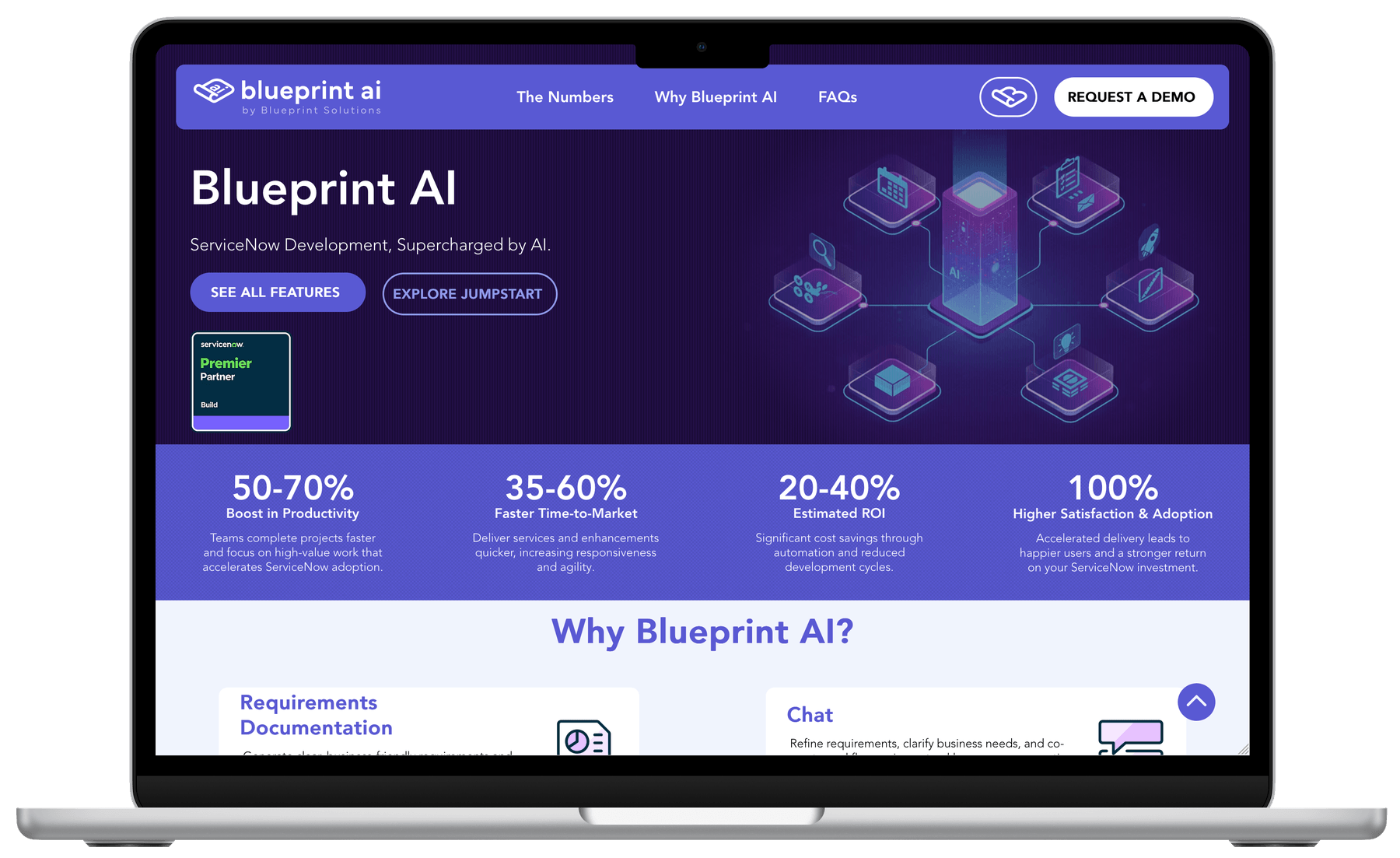 1440 × 720 — Homepage, desktop
Selling AI to people who have been sold AI
Blueprint Solutions is a ServiceNow Premier Partner — a consulting firm that spent years implementing the platform inside other people’s organizations. Then they built something of their own: Blueprint AI, a patent-pending platform that installs directly inside a customer’s ServiceNow instance and automates the full development lifecycle, from requirements through technical design, build, testing and deployment.
Then the hard part. The buyer here is a ServiceNow platform owner who has sat through two years of AI pitches and has learned to discount every one of them on sight. And there is a specific, unavoidable objection waiting in every evaluation: ServiceNow ships its own AI. Now Assist for Creator is already in the platform. It is the first thing anyone asks about.
So the site had two jobs pulling against each other. It had to make a serious technical claim — this automates your SDLC — without sounding like the AI marketing this audience has already trained itself to skip. And it had to answer "why not the one ServiceNow already gave me" before a salesperson was ever in the room.
There was a third problem, quieter than the other two. Nothing about a consulting firm’s website prepares it to host a product. A services site sells people and experience. A product needs features, documentation, terms, a demo path and a different voice entirely — and it needed all of that without orphaning the credibility of the parent company.
Four decisions that set everything else
The product is the homepage
The root domain opens on Blueprint AI, not on Blueprint Solutions. The firm becomes the credential inside the lockup — "blueprint ai, by Blueprint Solutions" — and the company pages sit behind it. A partner firm’s about page has never closed a product deal.
Numbers before adjectives
The band immediately under the hero is four figures and nothing else. No mission, no values, no paragraph about the future of work. The headline makes a claim and the very next thing on the page is the evidence the client is willing to put its name to.
Name the competitor on the page
“How is Blueprint AI different from Now Assist for Creator?” is a question in the site’s own FAQ, answered in writing. Most product sites route that objection to a sales call. Publishing it costs a little control and buys a great deal of credibility.
No AI theater
There is no chat widget on a site whose product is a chat interface. No typing animation, no gradient orbs, no particle mesh. One isometric diagram of the development lifecycle carries all of the AI imagery. A site that performs AI at you undercuts a product asking for access to your instance.
A product identity inside a consulting brand
Blueprint AI had to read as a product without cutting itself loose from its parent. The lockup does that work quietly: a lowercase "blueprint ai" beside the Blueprint mark, with "by Blueprint Solutions" set small underneath. Endorsement, not separation — the product leads, the firm vouches.
The palette is narrow on purpose. A deep violet ground carries the hero and every moment that needs authority. A saturated indigo carries the performance band and every primary action on the site. A cool near-white panel holds the eight feature sections, so the longest reading stretch of the site is the lightest. A deep navy-violet closes the footer.
There is exactly one color outside that family: a green reserved for a single job — event and announcement bars, like the Knowledge26 banner. It appears nowhere else, which is what makes it work when it appears.
Avenir LT sets everything in two weights only: 85 Heavy for every number, headline and label, 35 Light for every line of body copy. Two weights is a real constraint, and it is the reason a marketing team can add a page eighteen months from now without the site drifting away from itself.
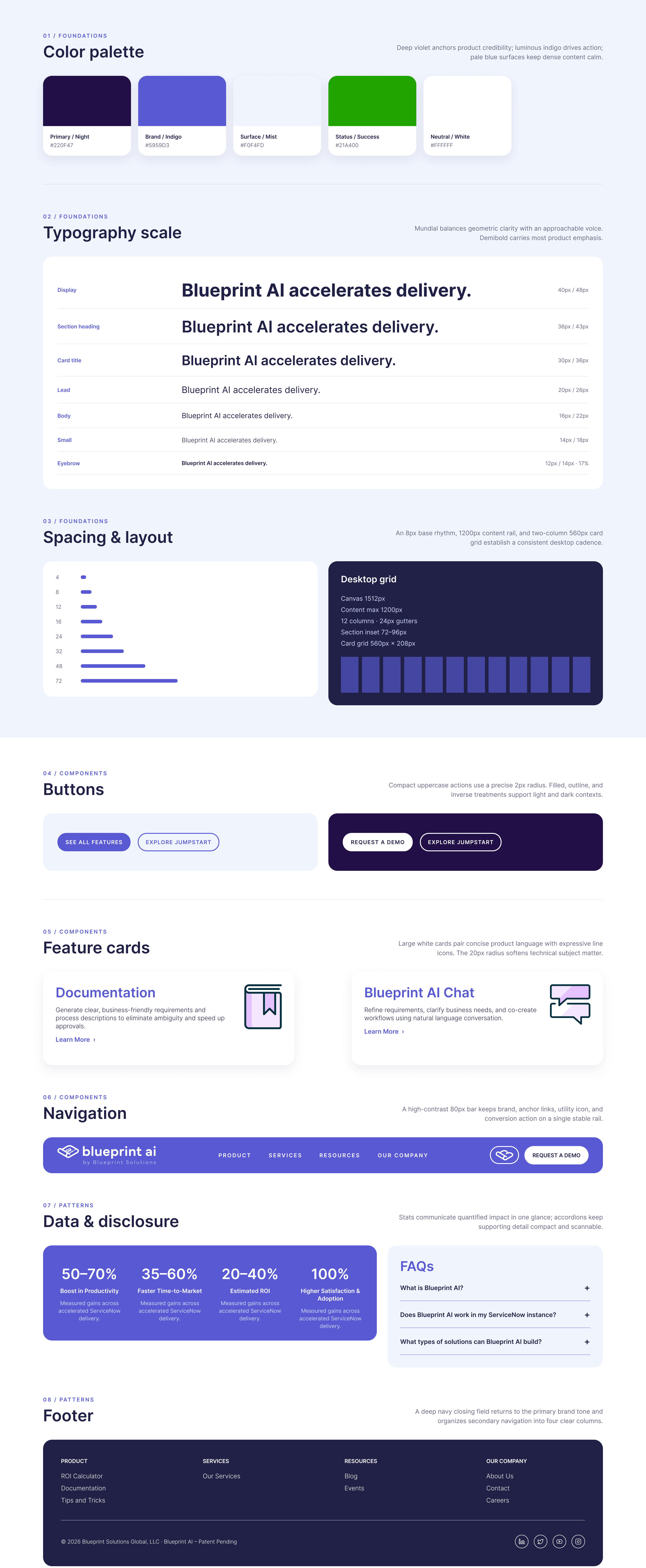 2880 × 6990 — Design system board
The page follows the sales conversation
Four questions, in the order they get asked. Does it work — the performance band. What does it actually do — eight named capabilities. Why not what I already have — the FAQ. What does it cost me to find out — Request a Demo, in the nav, in the hero and in the footer. The scroll order is the objection order, not a template.
Two depths for the same eight features. On the homepage each capability gets a name and one sentence. On "/blueprint-ai-features" the same eight get a paragraph and three concrete benefits each. Skimmer and evaluator read the same content at different resolutions — nobody has to read the long version to get the short answer, and nobody hits a dead end when they want more.
A three-item navigation. The Numbers, Why Blueprint AI, FAQs — and a demo button. Services, documentation, terms, careers and company all live in the footer, where people who want them will look. A nav with nine items is a nav that has not decided what it wants you to do.
Capability names a buyer already uses. Requirements Documentation. Technical Design. Test Cases. Automated Testing Framework. Update Set Deployment. These are the names of the buyer’s existing job steps, not invented product nouns — so a platform owner can map the tool onto their week without a glossary.
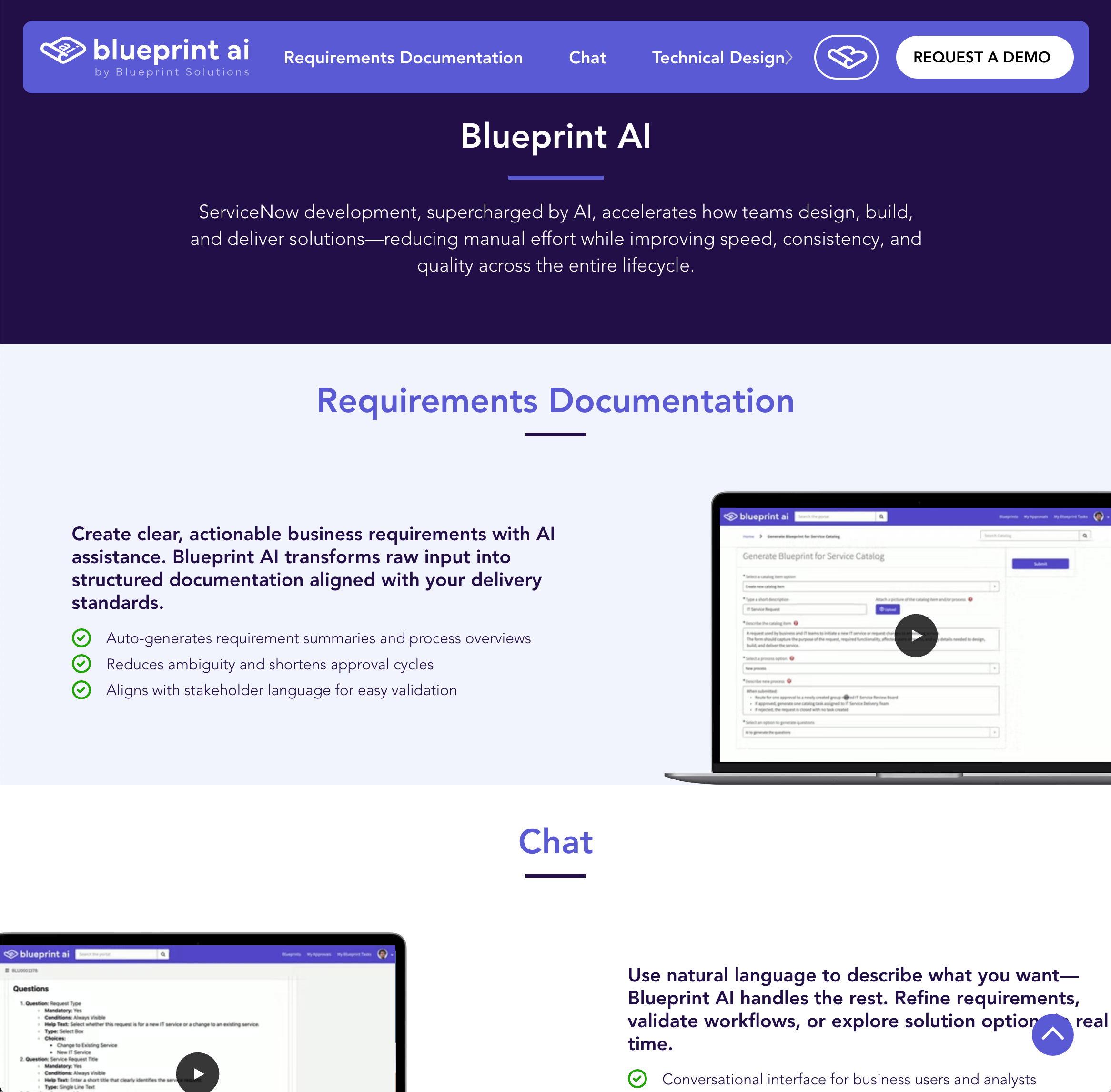 2332 × 2292 — /blueprint-ai-features
Jumpstart: a service that can’t dilute the product
Blueprint AI is sold two ways. As software a customer runs themselves — and as Jumpstart, a managed engagement where Blueprint’s own team operates the platform inside the customer’s environment. That is a positioning trap: a product that arrives with consultants attached stops sounding like a product and starts sounding like the consulting the firm was already selling.
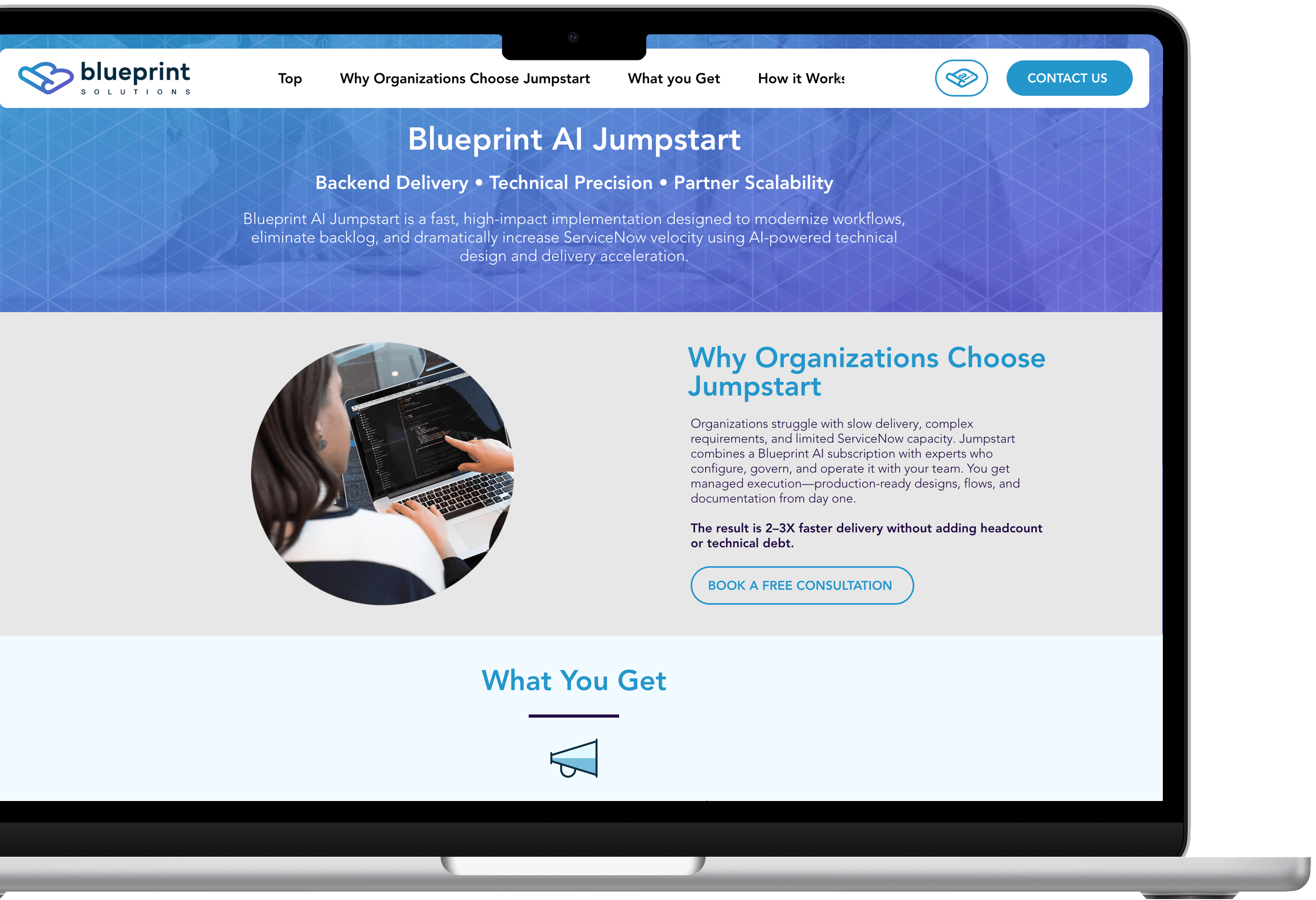
The separation is structural rather than editorial. Blueprint AI lives at the root, as software. Jumpstart lives under "/services", as a service, with its own spine — Activate, Operate, Scale. The hero’s second button is the only bridge between them, and it is always the secondary button, never the primary.
Activate
Deploy and configure Blueprint AI to the organization’s own standards, conventions and data model.
Operate
Run configuration, governance and quality alongside the platform team, producing catalog items, workflows, documentation and tests continuously.
Scale
Sustain and expand delivery velocity on a proven operating model — without adding headcount or technical debt.
Claims the client can stand behind
The performance figures on this site — the productivity, time-to-market, ROI and adoption numbers — are Blueprint Solutions’ own, drawn from their delivery experience. They are the client’s claims about the client’s product, and the site is built to present them that way rather than to dress them up.
In a category where every competitor is inflating, the credibility move is the opposite one. These were the rules:
- Ranges, not points“50–70%”, never “60%”. A range reads as something measured across real engagements. A single clean number reads as something decided in a meeting.
- The hedge stays in“Estimated ROI” keeps the word "estimated", on the page, at full size, in the same weight as the number above it.
- No borrowed proofNo customer logos we could not clear, no invented testimonials, no case studies that did not exist yet. An empty proof section is survivable; a fabricated one is not.
- The competitor gets answered, not attackedThe Now Assist question is answered on its merits — a full end-to-end SDLC versus a point assist — without a comparison table or a dismissal of the platform the buyer already owns.
- Patent pending, stated onceIn the footer, as a fact, not repeated through the copy as an argument.
- Plain language over category languageNine FAQ questions written the way a platform owner actually asks them, including the two nobody wants to publish: how is this different, and is my data secure.
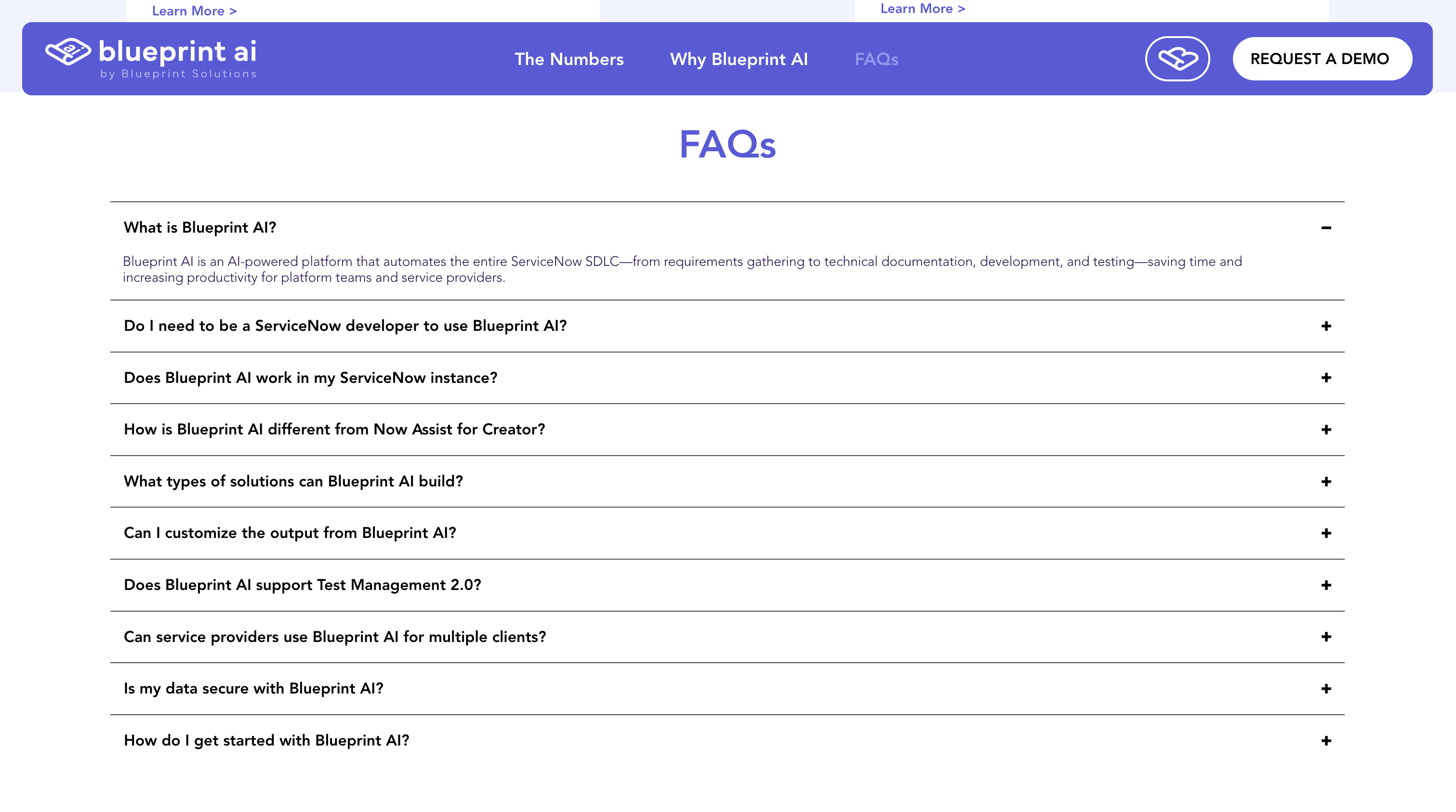 3022 × 1686 — FAQ section
Built to be handed over
The site runs on Wix Studio. That was a decision, not a default, and it is worth stating plainly instead of hiding it behind a stack list.
The alternative was the one an agency normally prefers: a React front end on a headless CMS. Faster, more controllable, more impressive in a portfolio — and completely dependent on us. Blueprint Solutions ships product continuously. A new capability, a documentation update, a conference banner three weeks before Knowledge. In the agency model every one of those becomes a ticket, a quote and a wait.
So the build optimized for something else: a marketing team that can change the site on a Tuesday without calling anyone. The design system is what protects the work — two type weights, five colors, a fixed set of section patterns. What the client can change is content. What they cannot accidentally break is the identity.
The Knowledge26 announcement bar is the clearest example. It was built as a repeatable pattern rather than a one-off: green field, headline, one supporting line, one link. Next conference, three fields change and nobody needs us.
The same logic shaped the information architecture. Product, Services, Resources and Company are four fixed footer columns with room to grow, so documentation, tips, events and success stories each have a home waiting for them before the content exists. Sites decay when new content has nowhere to go.
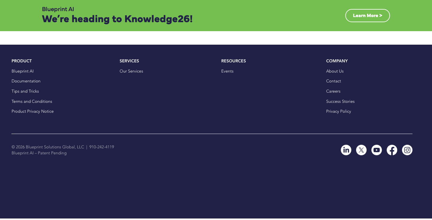 1440 × 734 — Announcement pattern & footer IA
What shipped
“The fastest way to sound like every other AI product is to behave like one.”
Almost every decision on this site was a subtraction. The chat widget that was not added. The second accent color that was not needed. The comparison table that would have won an argument the buyer was not having. The objection that was answered in public instead of routed to a sales call. In a category where every competitor is adding, restraint is the positioning.