

gotReps
A two-sided marketplace connecting companies exhibiting at trade shows with local, multilingual sales representatives — logo, visual identity and the website that had to speak to both sides of that marketplace at once.
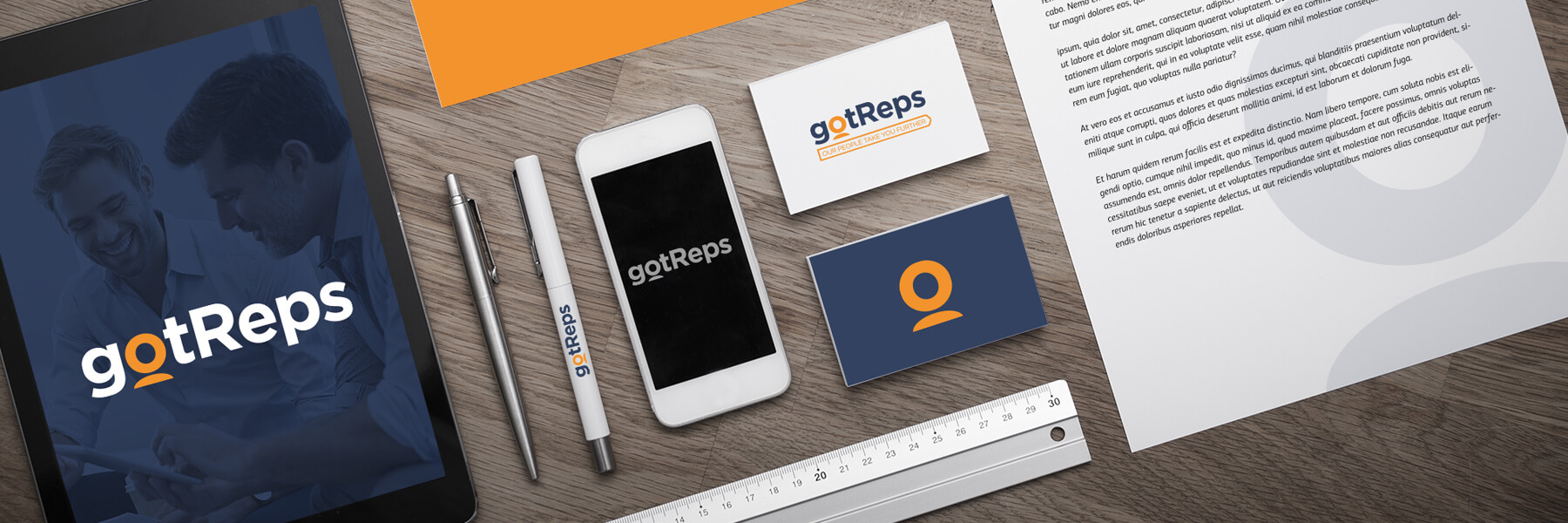 1800 × 600 — Brand collateral
One brand, two very different audiences
gotReps was built around a simple idea: companies that exhibit at trade shows and events need people on the ground — local reps who know the market and can work the booth — and there is no efficient way to find them for a single event. The platform’s job is to connect both sides and get out of the way.
That put two opposite audiences in front of the same homepage. A brand manager evaluating whether to trust a platform with their trade-show presence needs to see something that reads as professional and established. A rep looking for event work needs to see something that reads as fast, fair and worth signing up for. Neither identity nor navigation could favor one over the other.
The identity also had to double as an interface element. The mark needed a version that could shrink to an app icon or a status dot without losing what made it recognizable at full size.
A logo that doubles as an icon
The wordmark carries the emphasis in a single letterform: the “o” in “gotReps” becomes a rounded pin — part location marker, part person — rendered solid in orange against a navy lowercase set. Pull that one shape out of the wordmark and it still reads as gotReps on its own, which is what makes it work as a favicon, an app icon or a single accent dot in the product UI without any redrawing.
The supporting tagline, “Our People Take You Further,” is set in the same orange inside a signal-flag shape — a small nod to being pointed somewhere, kept out of the mark itself so it can be dropped for small-space applications.
#304060
#F09028
#FFFFFF
 Primary lockup
Built to survive a business card first
Stationery, apparel and a tablet-based sales kit were designed alongside the logo rather than after it, so the same navy-and-orange system had to hold up on a dark business card, a white letterhead, and a phone screen without any version feeling like an afterthought.
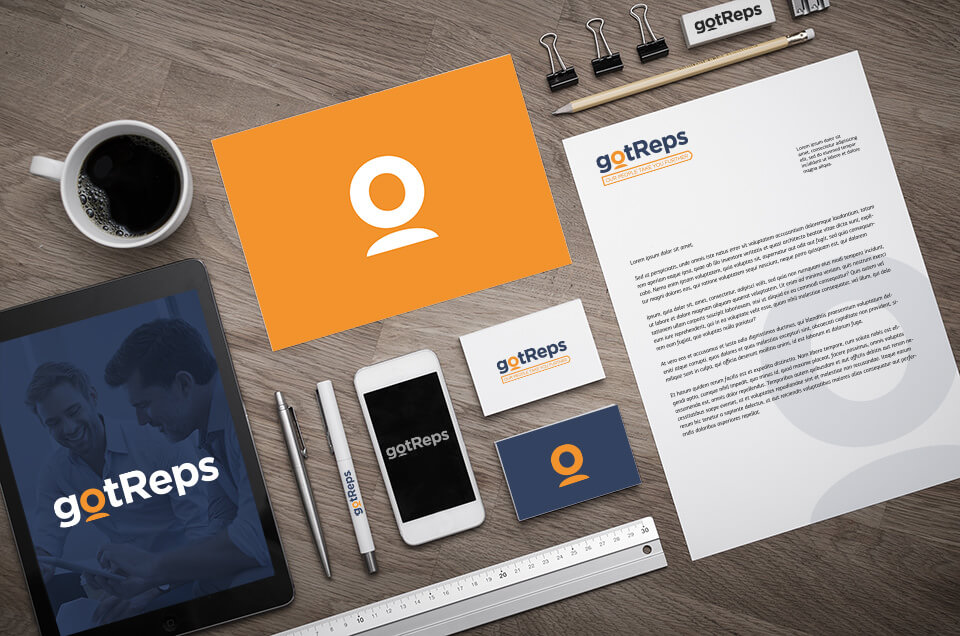 Stationery & brand applications
Two entry points, one information architecture
The homepage never asks the visitor to declare who they are before it earns their trust. Instead it presents both paths side by side — Find Reps for companies, Become a Rep for sales reps — and the navigation menu mirrors that split all the way down: each path gets its own How It Works, What We Offer and FAQ, reachable without forcing a role choice first.
What the platform actually offers to a company breaks into three plain categories: Professional Reps (industry expertise, sales acumen, multilingual staff, event experience), Event Software (digital surveys, lead capture, e-content delivery, behavior tracking), and Booth Services (rental, full graphics, delivery and setup). Naming the offer this plainly did more for trust than any amount of hero copy could.
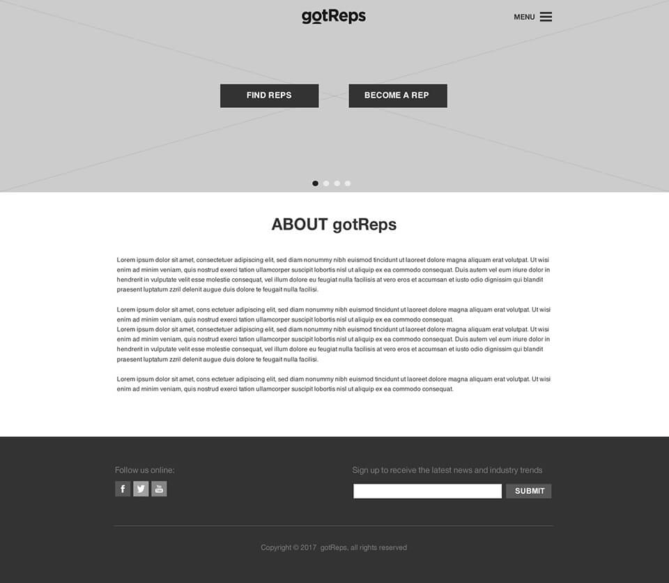 Homepage wireframe
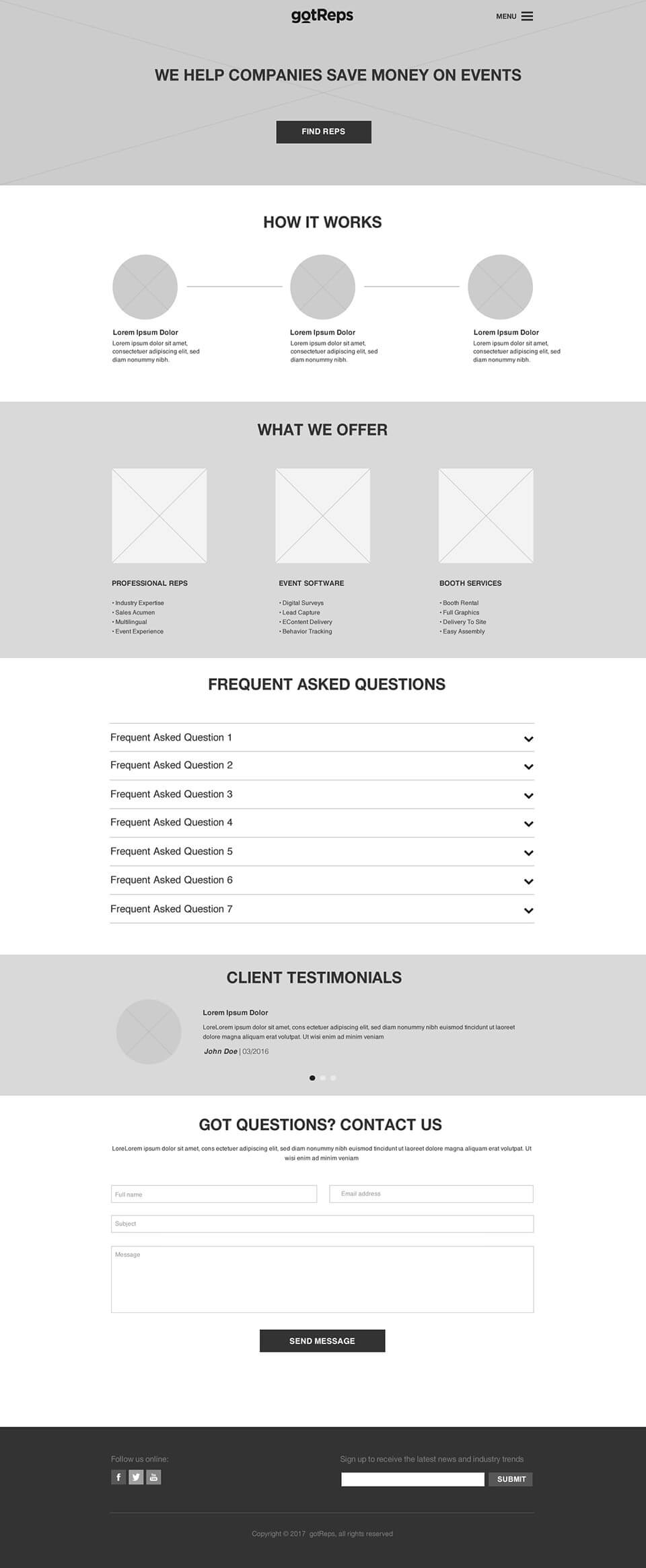 Full homepage wireframe
From wireframe to a site a client could build
After a few rounds of feedback on layout and hierarchy, the design was locked and every asset — logo files, style guide, page comps for desktop and mobile — was handed to the client’s development team to build. That handoff is the actual test of a web design engagement: whether a developer who wasn’t in the room can build it correctly from what they were given.
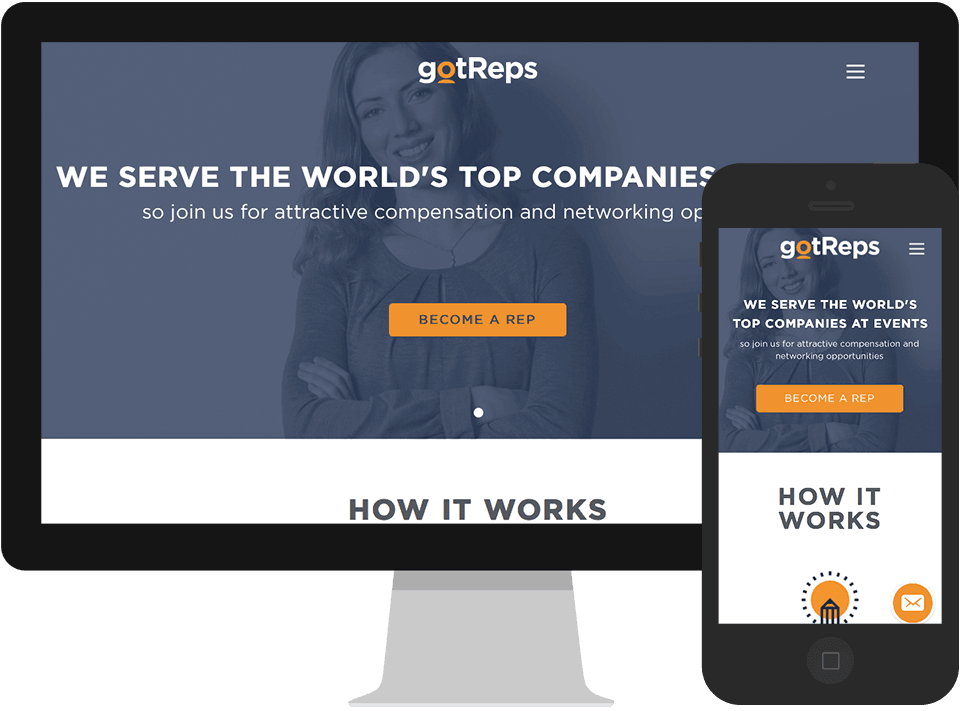 Homepage — desktop & mobile