

Guantanamera
The complete identity for a Cuban restaurant in South Austin — logo, stationery, campaign print, food art direction, a one-page site, and the dining room itself. One system that had to hold on a business card, on a window, and on a thirty-foot wall.
 1440 × 720 — Identity, primary lockup
Cuban is not a decoration
In Austin, Cuban arrives pre-loaded with imagery somebody else already chose. Vintage cars, faded pastels, cigar labels, a Buena Vista Social Club record on the wall. It is a look available to anyone — which is exactly the problem. A restaurant serving real ropa vieja and a real cortadito ends up wearing the same costume as a themed bar that serves neither.
The ask was small and the stakes were not. One logo, for a new restaurant on Westgate Boulevard in South Austin — not a walk-by location, in a city where a new restaurant has roughly a year to become somebody’s regular place.
So the identity had two audiences it could not choose between. It had to read as authentic to Cuban and Latin American families who would know instantly if it were faked. And it had to read as worth the drive to Austinites who had never ordered a cortadito — without turning somebody’s culture into a theme for them.
Four decisions that set everything else
Source from a place, not a genre
The concept came from Old Havana’s hand-painted street signage and the Art Deco the city built between 1925 and 1935 — a real architectural period with real letterforms. Not “Cuban vibes.” A specific decade, in a specific city, that a Cuban customer recognizes on sight.
One red, and nothing else
A single red, white, and a near-black for type. No pastel palette, no turquoise, no distressed textures. A restaurant buys menus, specials and signage on a schedule nobody plans — every extra color is a future inconsistency somebody else will print.
Design the smallest surface first
The mark had to survive a business card and a window vinyl before it earned the right to be big. So it was built as a badge: one plate, one block of letters, two stars, one rule. Everything that could not survive the reduction was cut.
The brand has to leave the screen
People experience a restaurant as a room, not as a logo. Consulting on the interior was part of the engagement, which is why the identity ends up on a wall at architectural scale rather than stopping at the menu.
A sign, not a logo
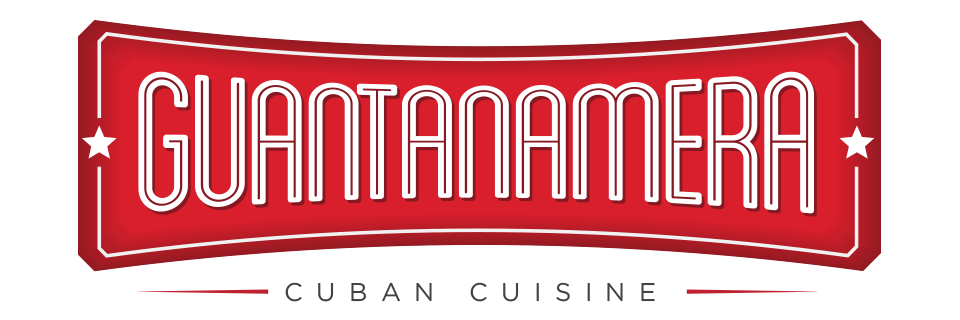
The mark is a cartouche: a slightly bowed rectangular plate with clipped corners and an inner keyline — the shape of a hand-painted shop sign bolted above a door in Habana Vieja. It reads as signage before it reads as branding, which is the point.
Inside it, the name is set in tall condensed capitals with an inline stroke — the letterforms of the Deco period — drawn to fill the plate edge to edge, so the word lands as one solid block at any size. Two stars flank it. That is the only nod to the flag, and it does the flag’s entire job without ever drawing one.
Beneath the plate, “Cuban Cuisine” runs in widely letterspaced capitals between two thin rules. That descriptor is the element that makes the whole thing work: it is the only part allowed to breathe, and the contrast between the packed wordmark and the open subtitle is what keeps a dense mark legible at two inches.
#D81F2B
#A31B24
#FFFFFF
#0B0B0D
 Primary lockup
The parts a restaurant actually hands you
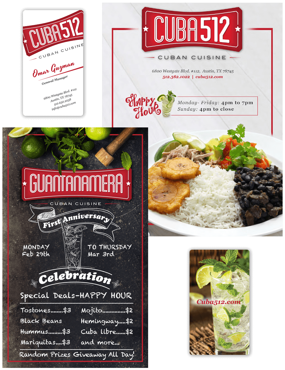
Stationery that stays in the system. Business cards, letterhead and in-store collateral all lead with the plate and then get out of the way. The one liberty is a script accent — a name, a “Happy Hour” — used sparingly enough that it still reads as warmth rather than as a second typeface.
A campaign that didn’t leave the brand. The First Anniversary promotion — four days, February 29 to March 3, 2016 — ran as a chalkboard poster with a hand-lettered banner, a line-drawn mojito and the deals listed at real prices. Promotional work is where small-business identities usually collapse, because whoever makes the flyer is whoever is free. Building the promo pattern inside the system meant the loudest piece the restaurant ever printed was still the same brand.
Food as the only photograph that matters. Art direction put the plate at the center on white — congrí, black beans, tostones, the sandwich pressed and cut — and kept props out of the frame. The food is the argument. Nothing on the table should compete with it.
 Stationery, campaign print & food art direction
One true photograph instead of a room full of props
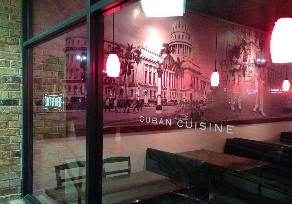
The identity’s largest application was never printed. The dining room’s long wall carries a full-width black-and-white photograph of Havana at street level — El Capitolio, the colonnade, palms, people walking, a car at the curb — with “Cuban Cuisine” set across it in the identity’s own letterspaced capitals. The glass carries the plate in vinyl. Warm low pendants, exposed brick, and nothing else.
The restraint is the decision. The available move was a wall of objects: license plates, a hung guitar, painted palms, a mounted trumpet. Instead the room shows a single real place, at scale, in black and white, and lets the identity sit on the glass in front of it.
It is the same rule as the logo, applied at forty times the size. Take one true thing from the actual place and let it carry the whole meaning — because a collection of references reads as a theme, and one photograph reads as a memory.
 Dining room — wall mural & window vinyl
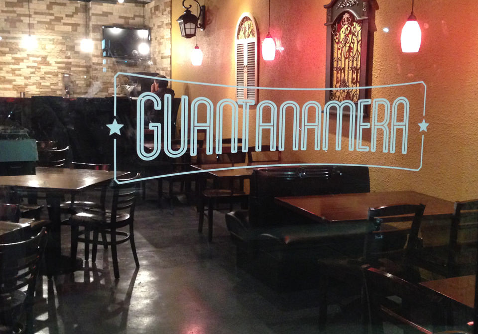 Dining room — second view
Four questions, one page
A restaurant website has one job, and it is not storytelling. Somebody is standing on a sidewalk or sitting in a parked car with a phone, deciding where to eat in the next four minutes. They need to know what it is, what they serve, where it is, and whether it is any good.
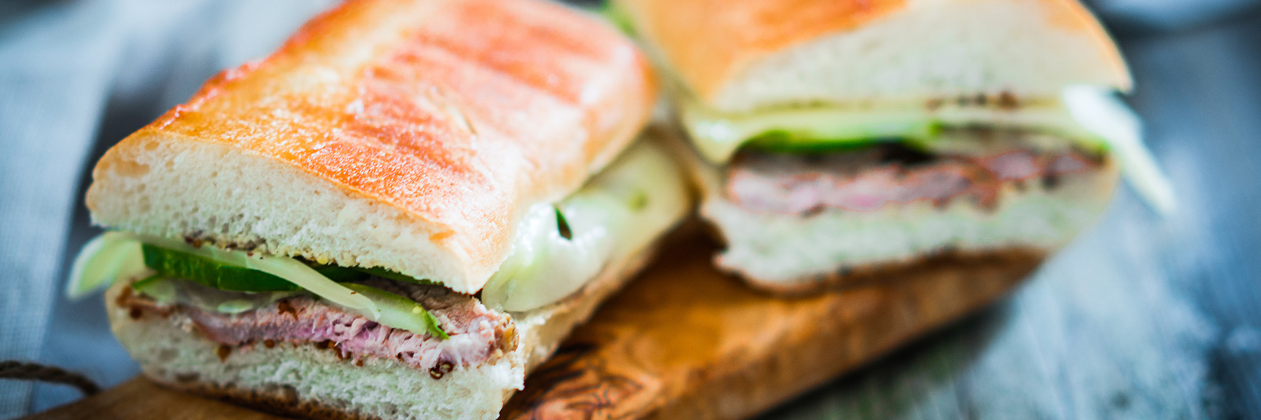
So the site is a single page — story, menu, gallery, location, testimonials, contact — built mobile-first in 2015, when that was still an argument to have rather than an assumption. The hero is a photograph of the sandwich at full bleed with the plate centered over it. No carousel, no splash, no reservation modal for a restaurant that took walk-ins.
The menu lives on the page as content rather than as a PDF download. It is the single most requested thing on any restaurant site, and handing a phone user a PDF is handing them a pinch-to-zoom problem at the exact moment they were ready to come in.
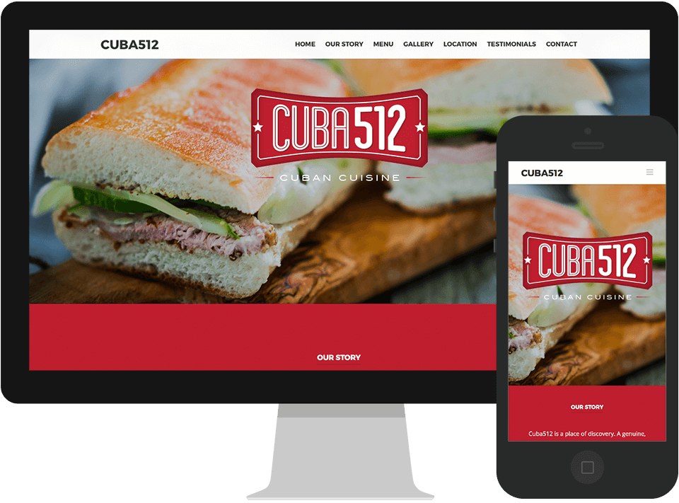 One-page site — desktop & mobile
The name changed. The system didn’t.
Some time after launch the restaurant renamed itself CUBA512 — a Cuban word and an Austin area code, a deliberate move toward the city it had become part of.
The identity was not redesigned. The plate stayed. The inline condensed capitals stayed. The two stars stayed, the letterspaced descriptor stayed, the red stayed. Only the word inside the cartouche changed — and CUBA512, four letters and three numerals, sits in that plate as though it had been drawn for it from the beginning.
That is the real result of this project, and it is not a metric. A small business made the single most disruptive change it can make to its own brand, and kept everything except the word — because the system was built around a structure rather than around a name. A logo that only works for the word it was drawn with is a logo with an expiry date on it.
What shipped
“Culture is a source, not a costume.”
The shortcut was available and it was cheap: pastel walls, a vintage car decal, the word Havana in a script font. It would have read as Cuban to everyone who had never been, and as a costume to everyone who had. The identity that lasted was the one built from a real period in a real city and then reduced until it fit on a business card — which is the same discipline this studio brings to a bilingual campaign a decade later. Knowing a culture well enough to leave most of it out is the work.