

Signet Interactive
A series of data-driven infographics designed to support a Houston digital agency’s blog content on marketing and media statistics — built inside their brand guidelines, made to be skimmed in a social feed and still hold up as a source.
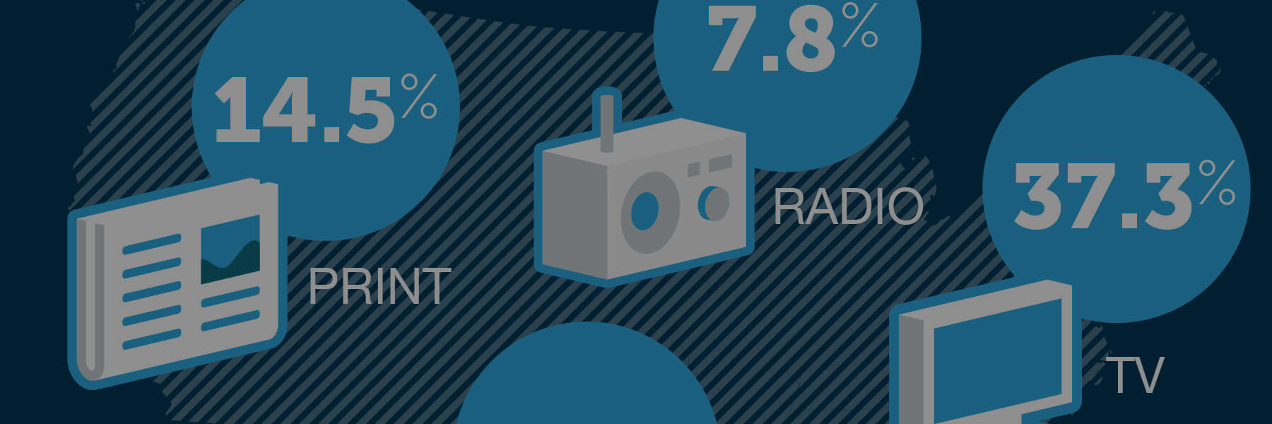 1800 × 600 — Ad share spending
Numbers an agency's clients could actually use
Signet Interactive needed a way to back up the advice they were giving clients — that budgets were shifting from traditional media to digital, and that customer experience was becoming a measurable line item — with sourced data their own audience would trust and share.
The brief was narrow and recurring: take a set of statistics from named sources, and turn each one into a single infographic that reads in the time someone spends scrolling past it. No client identity to build, no system to design from zero — the job was applying Signet’s existing brand guidelines consistently across a series, so each new post looked like it belonged to the last one.
Traditional vs. digital, made legible at a glance
Print, radio, TV and digital ad share sit side by side as proportionally-sized circles over a U.S. map — the shape doing the comparison so the reader doesn’t have to hold four percentages in their head. Supporting stats on mobile search spend and radio reach run below as a second, faster read for anyone who stops scrolling a second time.
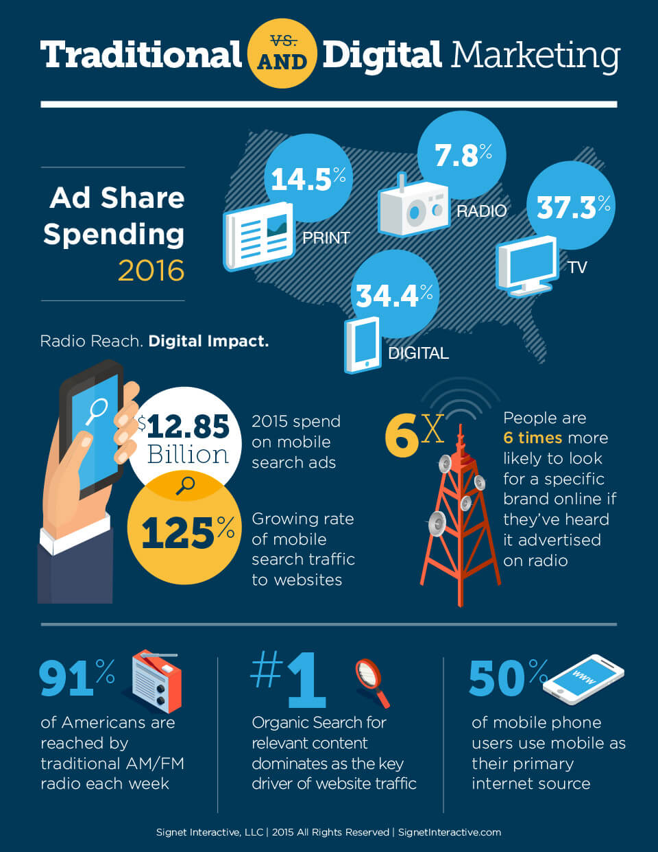 Ad share spending, 2016
Drawing the complexity instead of describing it
This one is a before/after diagram rather than a stat sheet: a brand’s reach to a customer mapped as a handful of clean, connected channels — then the same brand mapped against every channel a customer actually moves through today. The point isn’t any single number; it’s that the second diagram is visibly, immediately more tangled than the first.
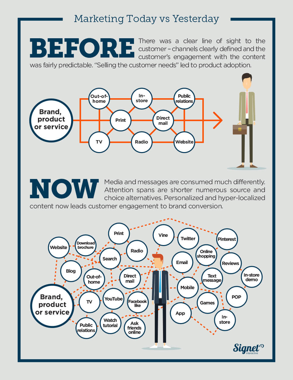 Marketing today vs. yesterday
The bigger picture behind the channel numbers
A companion piece to the ad-share breakdown, built for the reader who wanted the full year in one image: search’s growing share of ad budgets, where media-quality concerns were rising, and how far social had moved from a nice-to-have into a measured line item — content marketing generating three times the leads at 62% less cost, and Pinterest and Facebook alone driving the majority of e-commerce referral traffic. The kind of post a client forwards to their CFO.
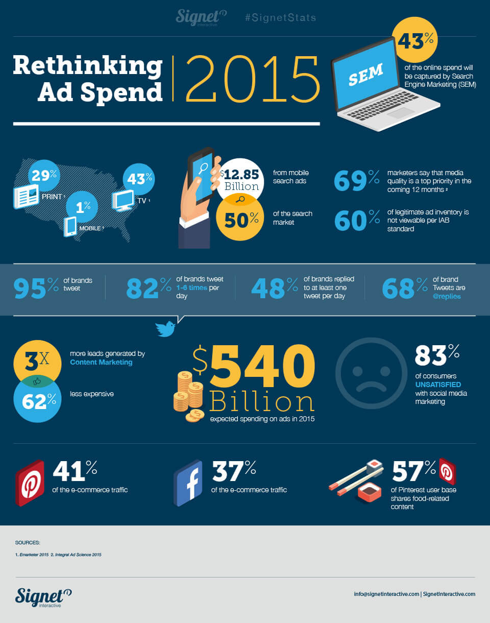 Rethinking ad spend
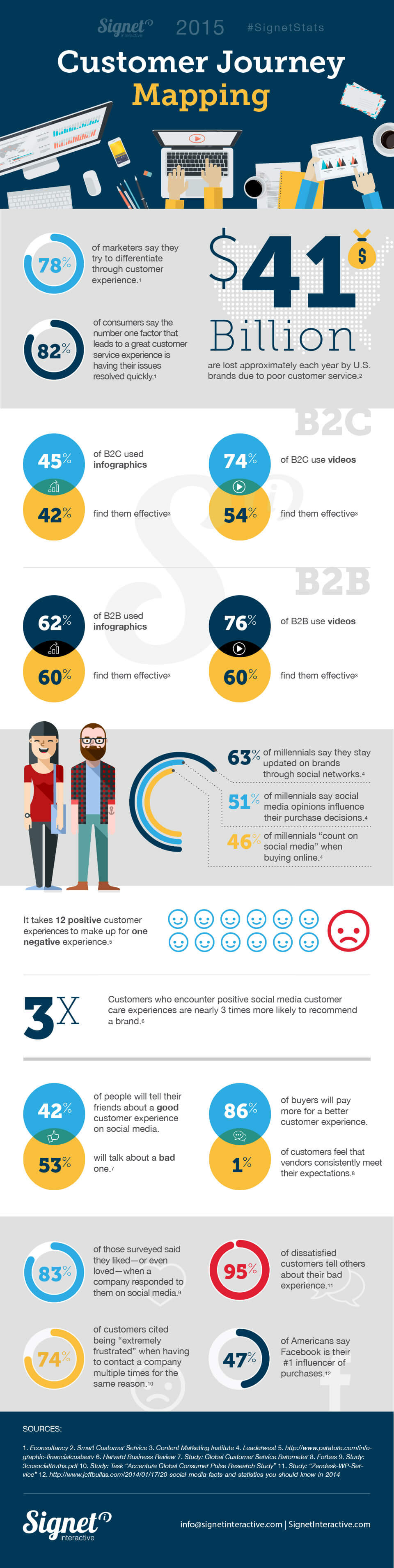
The cost of a bad experience, in one long scroll
The last piece in the series traded ad-spend statistics for something more human: what happens after someone becomes a customer. It compiles findings on response speed, social care, B2B versus B2C content effectiveness and how unevenly forgiving people are — twelve good experiences to make up for one bad one — into a single long-scroll reference an account manager could pull up mid-meeting.
 Customer journey mapping